A Use For Ghost Frames?

Last week I wrote a goofy post about what I called InDesign Ghost Frames. These are frames on a master page that have no stroke, no fill, and no not allow master item overrides. You can see the frame edges when you’re looking at the master page, but from a document page, there is no evidence that the frame exists. A curious oddity, and no more? Maybe. Then again, maybe there is a practical use.

A few days ago I was reading some people’s complaints about how it’s all too easy to forget you’re working on a master page. There’s nothing inside the InDesign document window that makes it obvious you’re working on a master page. Sure, there’s the page number at the bottom left of the window, but sometimes that can be off the screen, or obscured by other stuff. And if your Pages panel isn’t open, it’s up to you to remember where you are. More times than I’d like to admit, I’ve designed a whole page, placed text and images, and gone to print before I realized I’d put everything on a master page. D’oh! This never happened back in my Quark XPress days, because I had that big honkin’ chain icon at the top of a master page.

InDesign doesn’t have anything quite so honkin’. But with a Ghost Frame, you could make your own BHMPI (Big Honkin’ Master Page Indicator).

You could use any frame. But unfortunately, you can’t use open paths or lines, since both of those are invisible when they are unselected and have no stroke/no fill.

Still, there areplenty of lots of possibilites.

A letter to match the master page prefix.

Or something more exotic, like the Japanese kanji for “master?”

Or even a master Jedi.

Continuing to Slay Master Pages

If you have a great memory, or a thirst for knowledge about InDesign Master pages, then hold onto your wooden stakes, cause I’ve got even more to say on the subject of master pages. Oh yes, more to master here, folks.

If you remember the last time I wrote about master pages, then you remember that I basically explained what should go on the master page, how I would suggest linking and grouping items to make them easier to override on your local pages later, and other bits like that.

But now that we’ve got a decent handle on our opening spread (aka “the first two facing pages of your document”) we’re going to get jiggy with the file and start looking at the other pages that will come. Rarely would I ever recommend that all of the pages for your book exist in one file. However, I also wouldn’t suggest that you have every spread in its own document. This means you’re likely going to have a document that has the first two spreads rarely look like the rest of the pages in your document. This means that you’ll likely want more than one set of master pages.

But, oh and here is where it starts to get pointy, even though the bulk of the elements on this opening spread will be different than the bulk of the elements on the second spread, there are probably at least a few things that you want to have appear in the same position on every page. You could copy the repeating items on one set of master pages and paste them in place on the other master pages. But, anytime something happens more than once, that’s the opportunity to introduce streamlining into your files. Streamlining saves you time. And as you can tell from my lack of posts on the soon-to-be-famous Michael Rankin’s wonderful blog, I’ve been all about not spending time lately.

Here’s a shot of the master pages from the previous post so you can see how few elements that are on the spread.

Template Outlines

The designer has given you the design you’ll need for the rest of the pages in this document. It has even fewer elements. If you compare, you can see that in fact, most of the elements are repeated. Ooooh! You know what that means? You’re going to be so streamlined, that you’ll need to put brakes on your mouse so you don’t work too fast.

Second spread

Second sprea

The right (recto) page looks exactly the same in both screenshots. The left (verso) page looks mostly the same. Except the second shot doesn’t have a title and the main text box matches the size and relative placement of that on the recto page. If all of the pages in your document are going to look like either the first screenshot, or the second screenshot, then we’ve got the option to actually create 3 master pages that will make everything we do so much easier.

Wait? What!? If we’re streamlining this, why would I add another master page? Well because this third master page (which I’ve been in the habit of calling the Z-Master, simply because I like the letter Z and feel sorry that it doesn’t get used more often) will contain all of the elements that appear on every page in your book. The A-Master page will contain all of these items, and all of the items that are different from B-Master. And the B-Master will follow suit.

Since a picture is worth a thousand words, here is what your Z-Master will look like.

Z-Masterpage

Z-Masterpage

Almost exactly the same, right? Now what I’m going to do, is base my A-Master and my B-Master on my Z-Master.

To do this I’m going to go to my A-Master and select the title boxes and the verso text box. I’m going to cut them to the clipboard. Now I’m going to make sure that the recto and verso of the A-Master page are selected in the Pages pane and I’m going to choose “Master Options for A-Master” from the palette’s dropdown menu. I’ll get this window:

If you haven’t used that “based on” function before, I suggest you give it a whirl. Now all of the items on your page are duplicated, so simply Select All and then delete. An exact replica of what was on your page before should remain. Try to click on something. You can’t, can you? You know why?

Cause this page element doesn’t exist on this master page. It exists on the Z-Master page. Much the same way that items that are on a master page are not easily selectable on the local page, items that are on a Z-Master can’t be selected easily on the A-Master or B-Master. This means that any change you make to the items that live on the Z-Master will be reflected in every, single, page of your document. One change, affects the entire document. One change. Get it? See the streamlining now?

While you’re still on your A-Master page, Paste In Place the items from your clipboard. The title boxes and text box will appear. You can select these, change them, and those changes will only appear on the local pages that are based on your A-Master.

Here’s a great example of how this can save you tons of time. Say you’ve got a 30 page document and the footer for the document contains the chapter title on the recto and the unit title on the left. Just as you’re *this* close to making the final pdfs, the editor emails you frantically saying that all of the unit and chapter titles have to change. In a previous, less-efficient life, this would mean that you’d have to spend hours and hours copying and pasting those new titles into every page. With this new Z-Master, you have to make the change once per document. Glorious, glorious streamlining.

One other example that directly affects this example is this. We know that the background colors are going to change depending on the type of story the page will contain. If we’ve got a 30 page nonfiction selection and you need the background to be blue, all you have to do is apply your Object Style for the background to the one box on the Z-Master page and every page in your document gets populated. And when you “Insert Pages”, your 30-page document will look something like this in your pages pane.

It took an extra 3 minutes to create that Z-Master and base your A and B Master pages on it. But what you’ve done, by streamlining, is saved yourself potential hours of frustration. And saving time is always easier than saving the world.

Ohs and Wows, Vol. 1

On the re-certifcation front, I’m continuing to plow through the InDesign Help file. Some of it is like reading a how-to guide for tying your shoes, but occasionally there are things that make me go “Oh! So that’s what that does,” or “Wow! That’s freaking awesome!”, or even, “Oh wow, I wish I’d known that before…” So, I’m going to start posting Ohs and Wows, in 50-page batches, with page references in case you want to check them out for yourself.

p.3
All InDesign/InCopy documentation is available in PDF and LiveDoc formats on the Resources Page at Adobe.com.

p.8
Fonts are installed during ID installation on a Mac at library/application support/adobe/fonts
or on a PC at startup drive/program files/common files/adobe/fonts

p.16
To show/hide all panels press tab (knew that already), but didn’t know that to temporarily show tab-hidden panels, move your mouse to the screen edge.

p.18
Press ctrl (same on Mac or PC-wow KBSC parity) while dragging a panel to keep it from docking.

p.19
To resize all panels in a dock, drag the gripper at top left. I just like the idea of there being thing called the gripper in ID.

To resize a single panel, drag a side or any corner.

p.20
To collapse a panel dock into pure icons, drag the gripper toward the screen edge till the text disappears.

p.24
Customizing menus: you can customize the main menu, panel menus, and context menus by choosing Edit > Menus

Show All Menu Items appears at the bottom of each menu where you’ve hidden items.

Holding the command key temporarily shows any menu choices you’ve hidden.

p.34
Slick way to jump to a master page: cmd-j then type the letter, then enter. So to jump to master page A, it’s cmd-j, a, enter.

Close all windows for the active doc: cmd-shift-w

Close all windows for all docs: cmd-shift-opt-w

p.35
Math in panel fields: to use the current value as part of the expression, click before or after it. becomes

Applying percentages in panel fields is even easier. So if you have  enter to get

p.36
Prefs and settings are stored in files called InDesign Defaults and InDesign SavedData, which are saved when you exit InDesign.

p.39
RAM and “the kind of actions you perform” limits the number of undos you have.

p.42
Mimimum Vertical Offset= how far the pasteboard extends from the page/bleed/slug, whichever is farthest out.

Good trivia: Maximum pasteboard vertical offset is 10 feet. Maximum document width is 18 feet. Minimum is 1 pt.

p.47

To override the current units in panel fields and dialogs, use these abbreviations:

inch- i, in, inch, ”
millimeter-mm
pics-p
point-pt, or p before the value
ciceros-c
agates-ag
NONE Are CaSe sensitive

p.49
More trivia: what are the only non-printing elements to remain on screen when you switch to Preview mode? A line drawn with measure tool and guides that were selected before switching into Preview mode.

p.50
Snap to Guides also makes things Snap to the Baseline Brid.

Working at 100% view makes it much easier to keep the X,Y position and width/height of objects at clean whole point values.

Meta-licious

Just a couple notes about stuff here and elsewhere.

I didn’t mean for this to become a total InDesign blog. I really didn’t. Otherwise I would’ve bought indelicious.com. I considered myself a Photoshop/Illustrator guy years before InDesign existed, and sometimes it’s just more fun to talk about those apps. But I’ve got InDesign on the brain, and it’s all good since ID pays the bills more than any other app. I just wish I had the time to explore other stuff more often. Hopefully in the spring…???? Anyway, strap yourselves into a purple chair, because for the foreseeable future, it’s probably going to be all-InDesign, all the time, with my re-certification and the conference coming up this fall.

Speaking of the InDesign Conference, I haven’t yet mentioned here what I’ll be doing there. I’m slated to do two sessions: one on Nov 12th on long document features, and another on the 13th on INX (InDesign Interchange Format), where I’ll be sharing the stage with Adobe Evangelist Tim Cole. Though I’ve yet to meet Tim, I’ve been in the audience for several of his talks at past InDesign conferences and I think being up there with him will be a lot of fun. Here’s his blog, InDesign BackChannel, and the show he does on Adobe TV with Rufus Deuchler, Caffe Fibonacci.

Last but certainly not least, I have an article on Type Tricks in the current issue of InDesign Magazine. Given the quality of what appears in the pages of that magazine, I’m pretty darn excited to be in there.

OK, now back to our regularly scheduled content.

Ghost In The Machine

Ahoy mateys! T’is I, Captain Mike, returned from my time at sea, with a tip straight from Davey Jones’ locker, on how to hoist a ghostly Jolly Roger on an InDesign page. Arrrr!

Whew, sorry for the piratespeak. A week of sun, sand, and gift shops stocked with eyepatches and rubber hooks will do that to a person. Here’s in interesting tidbit on what I have dubbed InDesign Ghost Frames, which I discovered last week on the Vineyard while my kids were watching Scooby Doo. Coincidence? Hmmmm.

I never believed in ghosts till I started reading the InDesign Help file. I’m not talking about the ectoplasmic remnants of ex-people. I mean spooky page objects that affect a layout even though you can’t see or select them. Behold, an empty looking document page.

All layers are visible. Guides and frame edges are showing. You’ll have to trust me on those; scout’s honor. OK, nothing there, right? Now I draw a frame and fill it with text.

ZOINKS! It’s the ghost of Credit Card Bills Yet To Come! This page is haunted! Or is it? There must be a perfectly logical explanation. Hop in the Mystery Machine and help yourself to some Scooby Snacks. We’re going to find just what this ghost is made of.

In a new document, go to a master page and create a text frame. Using a ghastly font, type a ghoulish glyph.

Convert it to outlines (cmd-shift-o).

Now let’s gracefully remove the outlined glyph from its frame. With the Selection tool, select the text frame and the outlined glyph, then choose Object > Pathfinder > Intersect.

Scale it to monstrous proportions.

Turn on Text Wrap: Wrap Around Object Shape, with zero offset.

Set stroke and fill to None.

And now for unmasking. Our ghost becomes totally invisible on a document page if we go to the Pages panel and uncheck Allow Master Item Overrides on Selection.

As a master page item, our skull and crossbones would normally have a dotted outline in its layer color. And it could be overridden by cmd-shift clicking/dragging it. But with this option turned off, the outline vanishes and the object cannot be overridden or detached from the master. From the document page, it is invincible and invisible–lurking until its presence is revealed by some unsuspecting text that wanders by. Of course, I could have used any object with text wrap applied to it; I didn’t have to start out with a glyph. But then you wouldn’t’ve gotten the bonus Pathfinder tip. Also, I did a Find/Change after filling the frame with text to remove all End of Paragraph markers and give the skull a cleaner outline.

I’m not yet sure what I’d use a Ghost Frame for, but it fascinates me that I can completely hide something on a document page. Maybe a less creepy hidden message or watermark. Keep this trick in mind if you ever can’t tell why text is jumping around on an otherwise deserted page. It’s also a good prank to play on your unsuspecting co-workers. Just make sure there are no meddling kids around to foil your plans.

All Workspace and No Play…

I leave for vacation in the morning. Trying to pack light. Let’s see, a week in Martha’s Vineyard, what do I need? Bathing suit, sunscreen, shark repellent, and the complete InDesign CS3 Help file. That ought to do it. If you’ve been following along, you may remember that I have enrolled myself in InDesign Summer School to fix my expired status as an Adobe Certified Expert. A few side projects have sidetracked my studying efforts, but 7 days on an island ought to help me get caught up. Hope no bullies kick sand in my laptop.

My study strategy is pretty simple. Read the Help file. All 667 pages of it, word for word, to fill in any little gap or misunderstanding in my InDesign knowledge. I actually like taking tests. I know, who the hell likes tests? Me and Lisa Simpson, I guess.

When I take a test, I don’t just want to just pass it. I want to crush it. Grind its little questions into oblivion beneath the graphite of my #2 pencil (or just click it to death in this modern age). So I tend to be a bit obsessive about studying.

It does take patience to slowly read every single word about how to insert the installation disc into your DVD drive, but I force myself in case there’s some hidden, wacky surprise hiding amidst the banality.

On page 66 it says if you play the installation disc backwards it installs Illustrator 88. Cool!

Right now I’m about 100 pages into the Help, taking notes as I go, and I have to say, it’s kind of like one of those novels I had to read for English Lit in college. But with a lot more numbered lists. And fewer duels. Formal, mannered prose. The first few chapters are all exposition. We meet the protagonist, learn what he does for for work, where he lives, who are his friends. Chapter 2 is where it starts to get interesting. It’s all about the setting. In those lit clasess I was taught the setting makes the protagonist who he is.

In InDesign, the setting is the workspace. I was never a big one for workspaces. I’d make them and then forget that I had them. I once got a few cheap laughs in a training, by making a workspace that literally covered the entire screen with panels (or palettes as they were called at the time). But now, since I was playing around with panels, docking and stacking them every which way, I figured it was the time to finally figure out my perfect workspace.

First thing I did was open every panel. All 41 of ’em (including the Control Panel, Tool Bar, and Typefi’s awesome, free AutoFit).

There’s a sight to behold. Click it and stand back.

Next came a simple sorting, where I asked each panel one question: Do I need you visible and at my fingertips at all times? Yes, and the panel got to stay, no and it got tossed back to the Window menu. Final tally, 32 panels got to stay, 9 got voted off the island. The losers? Color, Command Bar, Navigator, Script Label, Story, Trap Presets, and the Interactive triplets, Bookmarks, Hyperlinks, and States. I’m not saying I’ll never need these things, but I don’t use them often enough to keep them under my mouse at all times.

From there the strategy was bunch n’ crunch: grouping panels according to function, and squishing them down to icons. No way I want to have 32 panels even partially open. With the Control Panel up at eye level, and the Tool Bar anchoring the left side of my screen, I went for two docks of 15 panels each on the right side of my screen, broken into logical groups, and alphabetized within groups.

Let’s check out the groups.

The top left, closest to my mouse are the Frequent Flyers. Info, Layers, Links, Pages, and Swatches. I visit these things so often for checking things and getting around a document that my mouse has worn a groove in my screen.

Moving down, we have the Frame Finaglers. Align, Gradient, Object Styles, Pathfinder, and Stroke.

Further down, it’s Prepress Alley, with Attributes, Effects, Flattener Preview, and Separations Preview. This feels safe, like the three serious pressmen are surrounding the wacky designer, keeping him/her in check. BTW, I love wackiness, it just has to print, m’kay?

At the very bottom, side-by-side are the panels for collaboration: Assignments and Notes.

Back up to the top, on the right side there’s the all-type extravaganza, with Character, Character Styles, Glyphs, Paragraph, and Paragraph Styles.

I could probably jettison Character and Paragraph, which are pretty obsolete with the Control Panel looming over their little heads. I think I kept them more for the visual symmetry they allowed me.

Then it’s T time, with the everything to do with Tables, Tags, and Text Wrap.

Below is the Automation Station, with Data Merge, Index, Scripts, and Typefi AutoFit.

Pretty perfect. But we can kick it up one more notch by tweaking the Control Panel. Did you know you could customize what appears in the Control panel? If I ever did, I’d forgotten. This was one of those little payoffs for reading every word of the Help. Just go to the panel menu on the right side and choose Customize…

You get a dialog checklist for every piece of info displayed in the Control panel.

I didn’t need to do major surgery on the Control panel, but there were a couple of small things that bug me. For example, on the far right side, the Quick Apply and Bridge icons gotta go.

I’m still making friends with Quick Apply. I know it’s cool, and part of the coolness is that you’re supposed to trigger it with the keyboard shortcut (cmd-return). That’s what makes it, y’know, quick. And if I want to go to Bridge, I cmd-tab to it. So in the Customize dialog I scroll to the bottom and uncheck Other.

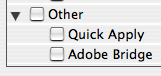
And see! Their “otherness” just confirms that they didn’t belong in the Control panel to begin with.

Now the good thing about pruning your panels is that InDesign will fill the empty space instantly with something else. Let’s see what I get for trading in Quick Apply and Bridge…

With text frames selected, I now get alignment buttons:

And with graphic or unassigned frames selected I get distribute buttons…

Works for me. Your mileage may vary, but the point is that you can really do a lot to tweak your workspace to your heart’s content, and maybe by doing so, make working in InDesign more efficient and more importantly, more fun. It’s all about the love.

My vacation begins the moment after I press the Publish button, but I will be ferrying this laptop over to MV. Don’t know if we even have internet access where we’re staying. If we do, I’ll post whatever cool stuff I find as I determine how many licks it takes to get to the center of the Help file.

One…two…

Speechless In Seattle

That is something I’d better not be. Come the second week of November I will be out in the great Pacific Northwest, behind a microphone, talking about InDesign to the people who know it better than anyone else on the planet. I’ve been invited to speak at the InDesign Conference Master Class at Adobe University from November 10–13. Yes, in 90 days I’ll be roaming the home of Starbucks, Jimi Hendrix, and InDesign. Order me a Venti Purple Haze. Lest you think I have been smoking wicker chairs, here’s the speakers page. Hey, if it’s on the internet, it must be true, right?

To say that I am excited about this opportunity is the understatement of the year. It is an honor, and great thanks go out to the stars of InDesignSecrets.com: David Blatner for inviting me, and Anne-Marie Concepción, for discovering this blog in the first place.

I’ve been in the audience for these things for so many years, it’s going to be weird to finally be the guy behind the mic. I can’t wait. These are my people. I’ve been reading their books and blogs for a very long time, but rarely joined in the conversation till now. Just being around all those brains full of InDesign knowledge is going to be great, and humbling. I’m used to being the go-to guy when it comes to InDesign, and Quark before that. But these are the capital G, Go-To Guys and Gals. I think I’m going to learn a ton while I’m out there. And being inside the mothership, at Adobe University only makes it all the more interesting. To a geek like myself, this is like the Willie Wonka factory tour. “See those Oompa Loompas, they’re coding a new Workspace that smells like milk chocolate.”

Once things are finalized I’ll post the titles of the sessions I’ll be doing there. We have some really fun and cutting edge stuff in the works. Before the conference this site will get a new look, and I hope to have some Publicious swag to distribute. Ah the joys of branding.

In the meantime, I’ll be filling my scuba tanks and taking the InDesign deep dive.

Ad hoc, ad loc, and quid pro quo,
so little time, so much to know.