TLF, my new BFF

Peoples, peoples, peoples, if you are the least bit interested seeing what will drive publishing workflows in the very near future, run, don’t walk your mouse over to the Adobe Labs and check out everything you can on Text Layout Framework. Such a dull-sounding name for such a mind-blowing technology. They should have called it the Textinator, or Fontapocalypse, or something. It’s going to be large. TLF (in beta) is a framework in Flash and Flex that will allow developers supreme control over typography in the browser. Any font, any layout, anywhere (OK, anywhere there’s Flash Player 10 installed, but that’s going to be everywhere).

That would be big enough news if it were just about a revolution in web design. But what I’m thinking about is the ways this technology could be used to make content, as well as deliver it. Because of what I do for a living, I’ve been babbling about the need to have content authoring in the browser. I’m sooo beyond sick of Word templates and web forms. I want an authoring tool with the feel of working in Adobe InCopy, with a rich layout and typography that matches what I get in InDesign, combined with the slickness of Buzzword, and capable of delivering some XML I can transform into some cool output.

Well, I think we just took a giant step in that direction with TLF. We’ll have websites and RIAs (Rich Internet Apps) that exploit TLF to deliver authoring anywhere. I promise you, in 5 years you won’t recognize the Creative Suite. This is the beginning of the end of the age desktop publishing applications, as we’ve known them for the last 20 years or so. They may be virtualized in the cloud, or mashed up and served as RIAs. They will morph and evolve like the liquid metal terminator in T2. But hopefully with less dying involved.

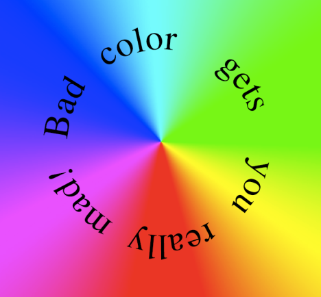
Bad Color Gets You Really Mad!

Well, maybe not if you’re Joe the plumb bob, but if you’re an illustrator, designer, or prepresser (what’s the feminine form, prepresstress?) it does. I came across another little paper the other day that I used to use for Photoshop training, and like the blend mode diagram, I offer it up here for your use.

This color wheel shows the relationship between CMYK and RGB colors, and has a handy dandy mnemonic for remembering the correct order of the colors:

Bad color gets you really mad. Blue cyan green yellow red magenta.

plish099-bcgyrm2

So how can this diagram help you in understanding those RGB and CMYK color models? Or more practically speaking, how does it help you color correct? Simply put, the components of a color are those that are adjacent to it. To make red, you add magenta and yellow, to make blue you mix magenta and cyan, to make green you mix cyan and yellow. That’s pretty obvious, even to a crayon-wielding 1st grader (I surveyed one at home last night).

But what might not be so obvious is that when you’re working in an additive color model, like RGB, green + red = yellow. Red + blue = magenta. And blue + green = cyan. Don’t believe me? In Photoshop, make two layers. Fill one with pure green (0r255g0b) and fill the other with pure red (255r0g0b). Now set whichever layer is on top to the Screen blending mode (which adds the brightness of the two colors).

plish099-makeyellow

Or you could do the old flashlight trick. Take two flashlights, cover the lights with colored cellophane, shine the two together. Be amazed. Actually it makes total sense. Light + light = brighter light, right? Right. In my house we use our make-your-own lightsaber kit, which comes with perfect translucent plastic circles. Cyan for Jedi, red for Sith. Opposites. Managed, your color is.

The other thing this diagram can teach you is how a subtractive color model works. In a subtractive color model like CMYK, the ink or (crayon wax) subtracts some of the light that passes through it before that light bounces up to your eyeballs. What part of the light does it subtract? The color that is opposite on the diagram. Need another mnemonic? How about Opposites Subtract? A blue crayon mark subtracts yellow light. That’s how it makes the picture bluer. And it works the same in Photoshop as it does in Crayola. When you’re in the Curves dialog box and don’t know whether to pull that Blue curve up or down, keep the Info panel open, and think of this diagram. More blue = less yellow. Less blue = more yellow. Too much cyan? Up the red. And so on. You can see this illustrated in the the Variations dialog as well. Those previews aren’t arranged randomly. They follow the same order as my “Bad Color” diagram.

plish099-variation

Master that color wheel and you’ll be saying, “Beautiful color! Gosh, you rock, Mike!”

I Just Had the Strangest Dream

Last night I dreamt I was in Seattle, speaking at the Adobe InDesign Master Class. It was weird and wonderful. Such a vivid and realistic dream, too. At one point I was at a Japanese restaurant eating sushi with David and Anne-Marie from InDesignSecrets. I think I ate shrimp heads and geoduck sushi. Like that really exists!

Then before I knew it, I was presenting a session on Long Documents, which went great. I had practiced it so many times, I had the whole thing memorized. Plus I had my dad’s handkerchief in my breast pocket for luck.

And there was a tour of the Adobe building where they make InDesign, and I wanted to go on that tour since there was a page from the last book I did up on their Wall of Fame, but for some reason I missed the tour and didn’t see it.

I did a second session on INX and IDML, with three brainy Adobe engineers watching in case I got stuck. They lent the exact right amount of deep developer cred.

Then the dream got really weird. At one point I was in a trivia game and I won not one, but two nose flutes! One purple and one blue. What the heck’s a nose flute?!

It was always raining in the dream. There was a part when I walked through the rain to an Italian restaurant. Inside I found a room that was empty, except for a big round table with nearly all the top InDesign experts that I know of in the world. People who’ve been doing fantastic books, and videos, and seminars for years. They were all sitting around, talking and joking and having fun and there was one empty seat at the table. I sat down there and joined the conversation, and found everyone to be even cooler and nicer than I had imagined.

Throughout the whole dream I kept meeting more interesting people, and of course we always had something to talk about—InDesign. It was a very “command-shift-option” kind of dream.

Then there was a scene where I was presenting some tips in front of everyone at the conference, and I screwed up by opening the wrong file, but it was more funny than truly embarrassing.

The last night, I met up with an old friend from high school that I hadn’t seen in 22 years, whom I had found through Facebook. We had dinner and beers and had a fantastic time catching up and reminiscing.

Man, what a dream….hmmm, what’s this in my pocket?

!!!!!!!!!!!!!!!!!!!!!!

plish098_noseflute

Icon Mining

72 hours to go until the InDesign Conference, and I have to take a break from non-stop InDesigning or I’m going to go InDeNuts. Here’s a tip for anyone who has to put together presentations or trainings about software and wants to have some nice visuals.

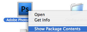
On the Mac, you can go icon mining by right/ctrl-clicking on an application icon and choosing Show Package Contents from the menu.

plish097-01

When you do this, the application opens like a folder and you can see all the bits and pieces that make up its interface.

Find a folder called Contents. It shouldn’t be too hard. Open it.

plish097-02

Look for another folder called Resources.

plish097-03

Inside Resources you will find all the little picture files and icons that the application uses. For some apps, there will be more than a thousand. The .icns are the big juicy icon files.

plish097-04

plish097-051

When you find something you like, be sure to COPY it to a new location, otherwise you may find the application gets very upset when it goes looking for a resource that isn’t there.

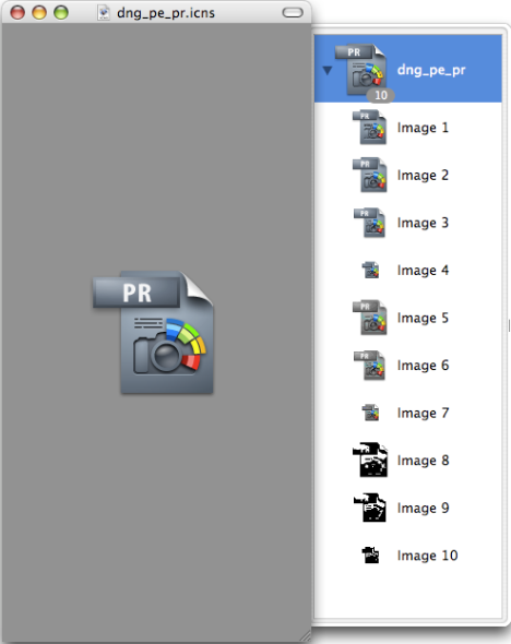
You can’t open .icns files with Photoshop, but Apple’s Preview works like a charm. Open the drawer attached to the right side of the window and you can see all the variants of the icon.

plish097-06

Select the one you want and save it as a PNG. That will preserve any transparency. Now you can open it in Photoshop, place it in InDesign, etc.

plish097-07

Yum. No sloppy screen grabs for you. Now all your presentations and training materials can be visualicious.